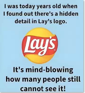
Everyone knows the Lay’s logo — the golden-yellow circle, bold red ribbon, and friendly white lettering
that instantly brings potato chips to mind. But few realize that this cheerful design hides a clever nod to the brand’s roots.
Founded in 1932 by Herman Lay, the company later merged with Frito to become Frito-Lay, and its logo evolved to reflect that partnership.
The yellow circle behind the name isn’t just decoration — it echoes the sun-like emblem found in Frito-Lay’s corporate logo, symbolizing warmth,
optimism, and freshness. The red swoosh adds energy and motion, giving Lay’s its signature vibrancy while tying it visually to its parent brand.
Color psychology also plays a key role. Yellow evokes happiness and appetite, while red grabs attention and stirs emotion
— a combination proven to attract snack lovers worldwide.
So the next time you grab a bag of Lay’s, look closer. Behind that simple, sunny design lies a story of
heritage and smart branding, showing how even a logo can celebrate history while sparking joy in every glance.